Cover to Cover – Part One
Usually you find a book review/devotion or a writer’s life/devotion on By the Book each Wednesday and Saturday. For the Cover to Cover series, we’re going a deeper into the process that takes an author’s manuscript and turns it into the book you purchase. Of course, we aren’t going to neglect the spiritual either. So, you’ll come away with a greater appreciation for the publishing world and some spiritual encouragement too.

Today we welcome Diane Turpin.
Diane Turpin is the cover designer for Mantle Rock Publishing and her own company, Diane Turpin Designs. Since 2014, she has created book covers in the genres of historical romance, contemporary romance, suspense and most recently, fantasy. She is the wife of a professional Boy Scout and mom of a musical daughter. In her spare time, she sharpens her crafty skills with watercolor painting and sewing.
- What prompted you to get involved in designing book covers?
My mother. Doesn’t it always start with your mother? Mom formed Mantle Rock Publishing and had published a couple of books before asking me to design covers for her. I was very active in the digital scrapbook world and had all the skills needed to create covers. I had used Photoshop extensively with digital scrapbooking and also at a previous job in a printing shop.
- How do you decide the best way to portray a book in its cover design?
Actually, it comes mostly from questions I ask the author. I want the author to have a cover they are proud of, so I ask them what book covers they are most attracted to. I match those responses to what genre they have written in and start from there.
- What do you feel a well-designed cover does for a book? How important is the cover to the book?
A well-designed cover says, “This book is worth your time investment to read it.” It should look intriguing enough to make the reader want to read it without telling the whole story. It sets up the framework for the reader to know what they are reading, whether it’s location, mood, era, romance, mystery, and so on. I think, next to a well-written book, it’s the most important thing…wink!
- Writers get writer’s block. Do you get cover designer’s block? How do you get over it?
YES! Especially when it’s the first cover I’ve done for an author. It’s hard for me to judge you from a questionnaire and a few emails. So, I worry that the direction I’m headed may not suit your style. After all, I want the cover to portray your writing, not necessarily my design style. Sometimes I get stumped. What do I do to get over it…usually, I do watercolor painting. It helps me get my creative juices flowing in a different direction to get the spark I need to finish up a cover.
- Authors have compared writing to childbirth and the finished product to their children. Do you feel that kind of connection to the books you’ve designed for?
Sure, but it’s more like kids I’m adopting out. LOL. I do have covers that I’m prouder of than others, mostly first covers or covers where I really stepped it up a notch.
- Is there one cover that stands out to you as a favorite?
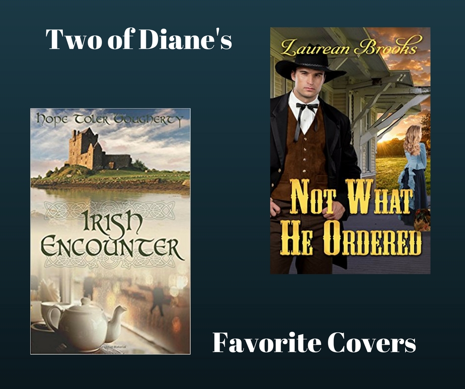
Irish Encounter by Hope Dougherty is one that stands out because I worried about it so much. I don’t remember if she wanted her main character featured or not, but I couldn’t find anything that resembled her character in clothing that was appropriate – she’s a middle-aged lady traveling in Ireland. I stepped out and went with my gut and the cover turned out great. It was one of my first covers, and I’m still proud of it.
Not What He Ordered by Laurean Brooks for a totally different reason. I met Laurean in person before I did her cover. In fact, we were at two retreats together, so I knew how funny and silly she was. We had so much fun creating her cover just because of our friendship. I also went out and photographed a historic train depot or two to add to her cover. After I got the depot on the cover, I realized I had to remove all the electrical conduit and light fixtures from the building. I had thought about the light fixtures when I took the picture, but the conduit was painted to match the siding and didn’t really jump out at me until I started working with the picture in Photoshop. All that hard work really endeared that cover to me.
When people ask, what my favorite cover is, it’s usually the last one I created. And just like your kids, I love them all.
- Is there anything else you’d like to share with us about your designing process?
I work primarily from stock photographs. I enjoy hunting for the perfect images to combine into a cover. Some covers, like the cover of Faith’s Journey, only take a couple of images to portray the right mood. Other covers, like Aimee by Pam Harris or Keeper of the Flame by Mary Kay Tuberty, take multiple photos in layers to get the perfect final image. My goal is for it to look so natural that you have a hard time picking out the individual photos that created the image. A Light At Bailey’s Harbor by Bethany Baker has clothing from one model, face from a second model and hair from a third. Not to mention that I created the sign for the title. It truly is more than just finding the right photo and adding some text. It’s setting a mood or evoking a feeling that gets you ready to read the story.
Special thanks to Diane Turpin for taking time out of her busy schedule to give us insight into the process of designing book covers. You can find out more about Diane at dianeturpindesigns.com.
By the Book: I love what Diane said, “It’s setting a mood or evoking a feeling that gets you ready to read the story.” Comment below on some of your favorite cover designs. While you’re at it, I’ve included some of my favorite Diane Turpin designs and pictures of the two she mentioned. Which of these are your favorites?


The Conversation
I’m a bit partial, but I love my cover!!!
I thought Diane really hit mine out of the park, but I’ve always liked yours too. And The Copper Box was the first cover I saw of hers that really caught my attention and kept it. I couldn’t help buying that one! (Of course, in defense of our covers, they weren’t created at the time!)
I may be a little partial, too, but I LOVE my cover. When I saw the finished product, I was in awe. Diane, you matched the title so well with the picture. Both say the same thing. “Not What He Ordered.” You can tell the cowboy’s not happy by his stance. And you know the heroine would rather be anywhere but there, by the way she’s staring off in a different direction. This is the first time I realized it works beautifully when a cover and title come together. Thank you, Diane. You are the bestest. Even if you did lock me out of the hotel. “Wink.”
I’m relieved to hear Diane say I was fun to work with. I thought I was being a pest.
It’s hard to pick favorites sometimes. I think she does a great job with all her covers. She has a talent for putting the right images together.
Of course, Faith’s Journey would be #1. And after seeing the other comments I don’t even feel a bit biased. Following close behind is the Copper Box.